# User menu
> The user menu offers user-related functions including login, logout, profile.

## User menu in header

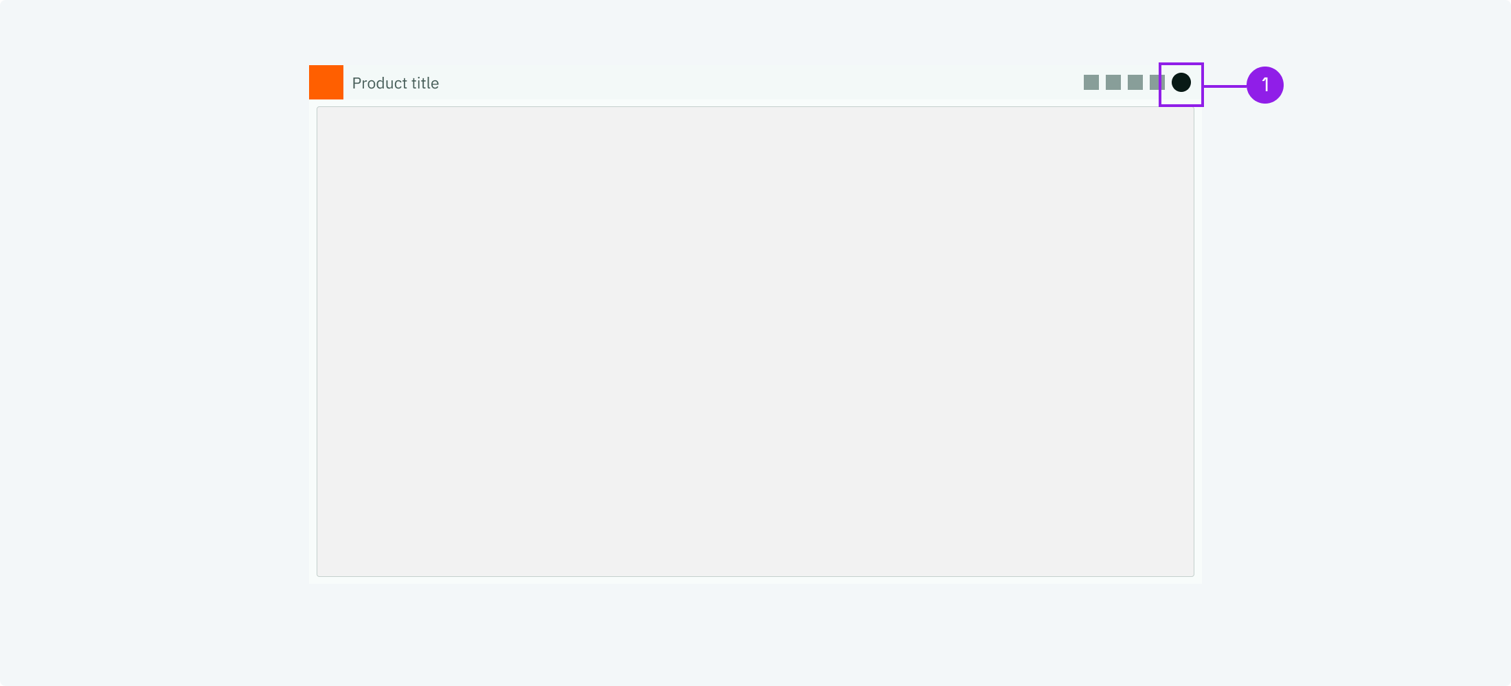
### Access through user avatar
![the avatar](https://next.wave-design-system.pages.dev/_next/static/chunks/images/BasicUserInteractionUserMenu1-0e01a7f0d90ae3743a990a2922e775a9.png)
1. Avatar

<DataList.Root orientation="vertical" emphasize="label">
  <DataList.Row>
    <DataList.Label>When to use</DataList.Label>
    <DataList.Value marginTop="spacingS">
      Whenever there is an application header it should contain a user avatar on
      its very right side. Clicking this avatar opens the user menu.
    </DataList.Value>
  </DataList.Row>
  <DataList.Row>
    <DataList.Label>Description</DataList.Label>
    <DataList.Value marginTop="spacingS">
      The avatar contains the starting letters of the user or a profile picture.
      This is handled by Volue Identity.
    </DataList.Value>
  </DataList.Row>
  <DataList.Row>
    <DataList.Label>Behaviour</DataList.Label>
    <DataList.Value marginTop="spacingS">
      Regular behaviour of a nav button of the header.
    </DataList.Value>
  </DataList.Row>
  <DataList.Row>
    <DataList.Label>Components</DataList.Label>
    <DataList.Value marginTop="spacingS">
      <ul margin="none">
        <li>
          <Link href="/components/avatar">Avatar</Link>
        </li>
        <li>
          <Link href="/components/app-header">App Header</Link>
        </li>
        <li>
          <Link href="/components/menu">Menu</Link>
        </li>
      </ul>
    </DataList.Value>
  </DataList.Row>
</DataList.Root>

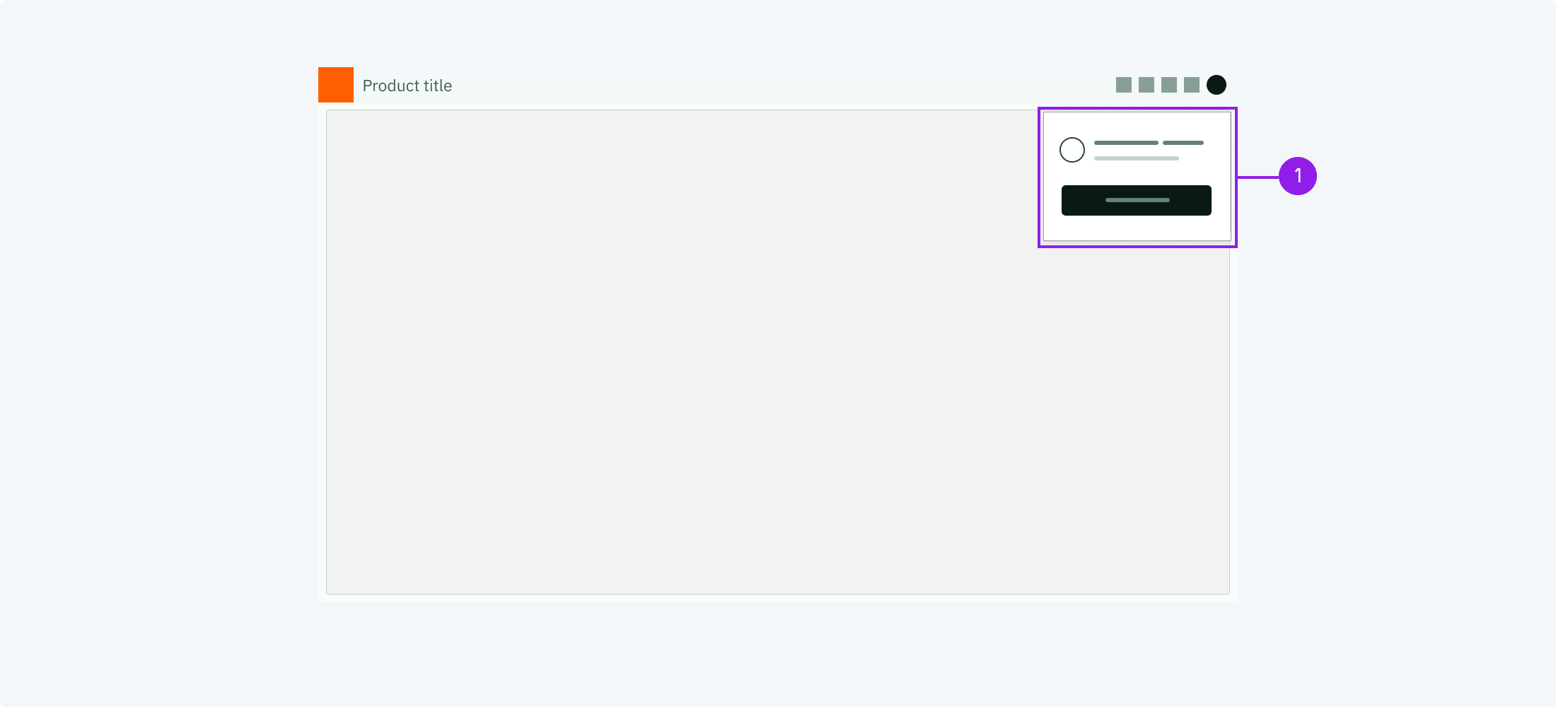
### User menu as drop down

![the user menu](https://next.wave-design-system.pages.dev/_next/static/chunks/images/BasicUserInteractionUserMenu2-097934418d4a2808ae9d5668793b40e6.png)
1. User menu

<DataList.Root orientation="vertical" emphasize="label">
  <DataList.Row>
    <DataList.Label>When to use</DataList.Label>
    <DataList.Value marginTop="spacingS">
      Whenever there is an avatar in the header it should open the user menu as
      a dropdown.
    </DataList.Value>
  </DataList.Row>
  <DataList.Row>
    <DataList.Label>Description</DataList.Label>
    <DataList.Value marginTop="spacingS">
      The user menu usually shows the avatar with the user name and their email.
      Below it offers a logout button which triggers the logout process.
    </DataList.Value>
  </DataList.Row>
  <DataList.Row>
    <DataList.Label>Behaviour</DataList.Label>
    <DataList.Value marginTop="spacingS">
      The dropdown should close if anything outside the dropdown is clicked.
      Clicking the logout button triggers the logout process and it is recommend
      to show a confirmation modal first.
    </DataList.Value>
  </DataList.Row>
</DataList.Root>

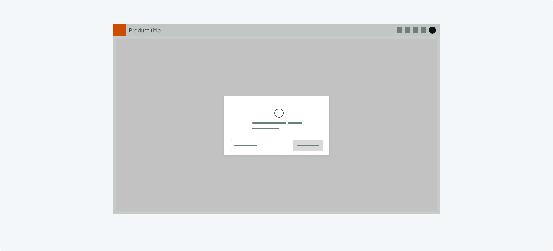
### Logout confirmation

![the avatar](https://next.wave-design-system.pages.dev/_next/static/chunks/images/BasicUserInteractionUserMenu3-f06bfc44333551316b489d5fc39f3469.png)
1. Avatar

<DataList.Root orientation="vertical" emphasize="label">
  <DataList.Row>
    <DataList.Label>When to use</DataList.Label>
    <DataList.Value marginTop="spacingS">
      Whenever a log out button has been clicked.
    </DataList.Value>
  </DataList.Row>
  <DataList.Row>
    <DataList.Label>Description</DataList.Label>
    <DataList.Value marginTop="spacingS">
      After a log out button has been clicked a confirmation modal should come
      up to make sure the user really wants to perform the log out. When the
      user confirms the log out process is continued.
    </DataList.Value>
  </DataList.Row>
  <DataList.Row>
    <DataList.Label>Behaviour</DataList.Label>
    <DataList.Value marginTop="spacingS">
      Regular behaviour of a confirmation modal: it pops out and overlaps any
      other content. Click on cancel closes it.
    </DataList.Value>
  </DataList.Row>
  <DataList.Row>
    <DataList.Label>Component</DataList.Label>
    <DataList.Value marginTop="spacingS">
      <Link href="/components/dialog#confirmation-dialog-example">
        Confirmation dialog
      </Link>
    </DataList.Value>
  </DataList.Row>
</DataList.Root>

---

## User menu in sidebar

### Access through user avatar
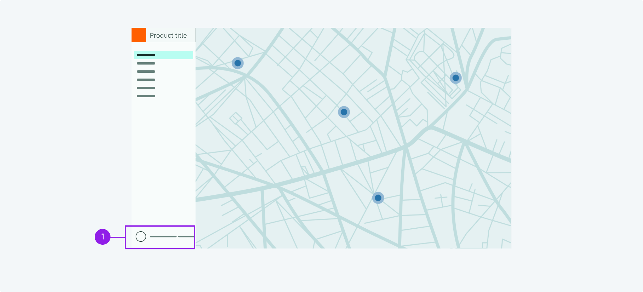
![the avatar](https://next.wave-design-system.pages.dev/_next/static/chunks/images/BasicUserInteractionUserMenu4-181c28f02cfe9ce38ae50cd606c4cab0.png)
1. Avatar

<DataList.Root orientation="vertical" emphasize="label">
  <DataList.Row>
    <DataList.Label>When to use</DataList.Label>
    <DataList.Value marginTop="spacingS">
      Whenever there is no application header but a sidebar it should contain a
      user avatar in the sidebar footer. Clicking this avatar opens the user
      menu.
    </DataList.Value>
  </DataList.Row>
  <DataList.Row>
    <DataList.Label>Description</DataList.Label>
    <DataList.Value marginTop="spacingS">
      The avatar contains the starting letters of the user or a profile picture.
      This is handled by Volue Identity. You may add the user name next to it,
      since the sidebar offers more horizontal space.
    </DataList.Value>
  </DataList.Row>
  <DataList.Row>
    <DataList.Label>Behaviour</DataList.Label>
    <DataList.Value marginTop="spacingS">
      Regular behaviour of a sidebar item.
    </DataList.Value>
  </DataList.Row>
  <DataList.Row>
    <DataList.Label>Component</DataList.Label>
    <DataList.Value marginTop="spacingS">
      <ul margin="none">
        <li>
          <Link href="/components/avatar">Avatar</Link>
        </li>
        <li>
          <Link href="/components/sidebar-navigation">Sidebar Navigation</Link>
        </li>
        <li>
          <Link href="/components/menu">Menu</Link>
        </li>
      </ul>
    </DataList.Value>
  </DataList.Row>
</DataList.Root>

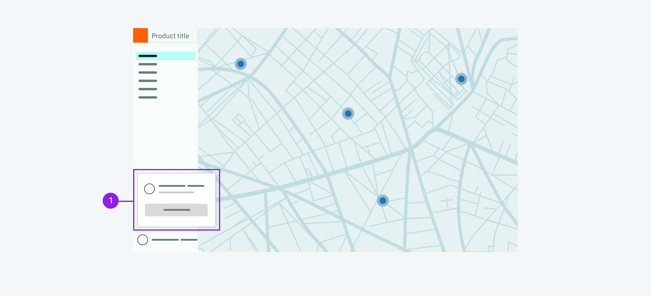
### User menu as flyout

![the avatar](https://next.wave-design-system.pages.dev/_next/static/chunks/images/BasicUserInteractionUserMenu5-1e7885eb8f28e4440ac3521c75f9283b.png)
1. User menu

<DataList.Root orientation="vertical" emphasize="label">
  <DataList.Row>
    <DataList.Label>When to use</DataList.Label>
    <DataList.Value marginTop="spacingS">
      Whenever there is an avatar in the sidebar it should open the user menu as
      a flyout.
    </DataList.Value>
  </DataList.Row>
  <DataList.Row>
    <DataList.Label>Description</DataList.Label>
    <DataList.Value marginTop="spacingS">
      The user menu usually shows the avatar with the user name and their email.
      Below it offers a logout button which triggers the logout process.
    </DataList.Value>
  </DataList.Row>
  <DataList.Row>
    <DataList.Label>Behaviour</DataList.Label>
    <DataList.Value marginTop="spacingS">
      The flyout should close if anything outside the dropdown is clicked.
      Clicking the logout button triggers the logout process and it is
      recommended to show a confirmation modal first.
    </DataList.Value>
  </DataList.Row>
</DataList.Root>