# Loading
>  A loading state is fallback element that is shown immediately upon navigation. You can pre-render loading indicators such as skeletons and spinners. This helps users understand the app is responding.

## Skeletons
![Empty states](https://next.wave-design-system.pages.dev/_next/static/chunks/images/LoadingSkeleton-239f276dcfcac22f68830c9e339cf1ad.png)
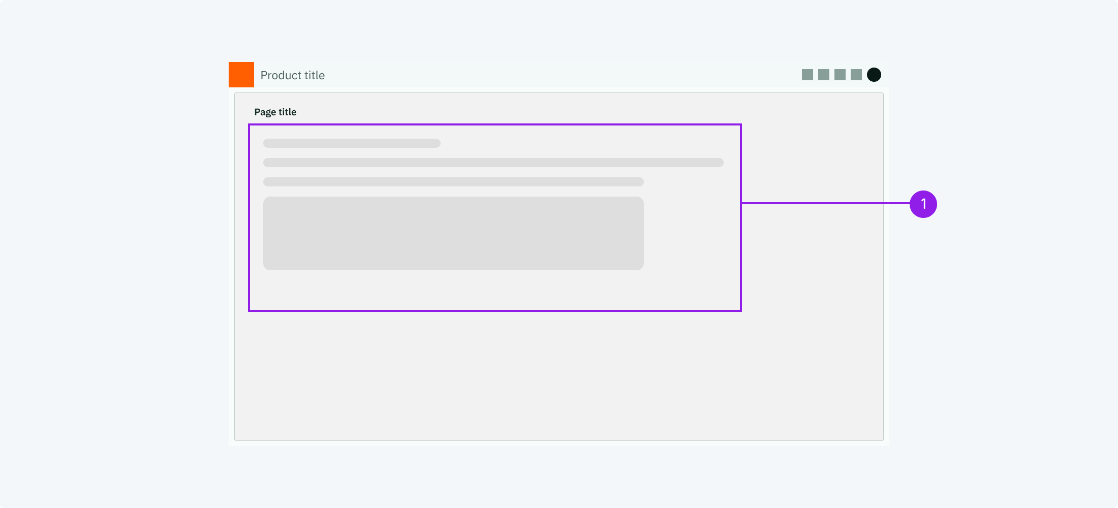
1. Example for skeleton loading indicators

<DataList.Root orientation="vertical" emphasize="label">
  <DataList.Row>
    <DataList.Label>When to use</DataList.Label>
    <DataList.Value marginTop="spacingS">
      Use skeleton as placeholder while you wait for content to load.
    </DataList.Value>
  </DataList.Row>
  <DataList.Row>
    <DataList.Label>Description</DataList.Label>
    <DataList.Value marginTop="spacingS">
      The skeleton loading indicators show a simple geographic shape instead of
      the data as long as the data is not yet available. As soon as the data is
      fully loaded the skeleton disappears and the data is shown instead.
    </DataList.Value>
  </DataList.Row>
  <DataList.Row>
    <DataList.Label>Behaviour</DataList.Label>
    <DataList.Value marginTop="spacingS">
      Same positioning as data.
    </DataList.Value>
  </DataList.Row>
  <DataList.Row>
    <DataList.Label>Components to use</DataList.Label>
    <DataList.Value marginTop="spacingS">
      <ul margin="none">
        <li>
          <Link href="/components/skeleton">Skeleton</Link>
        </li>
      </ul>
    </DataList.Value>
  </DataList.Row>
</DataList.Root>

## Spinners

![Empty states](https://next.wave-design-system.pages.dev/_next/static/chunks/images/LoadingSpinner-27d403140fd6dd3161d491029d91546c.png)
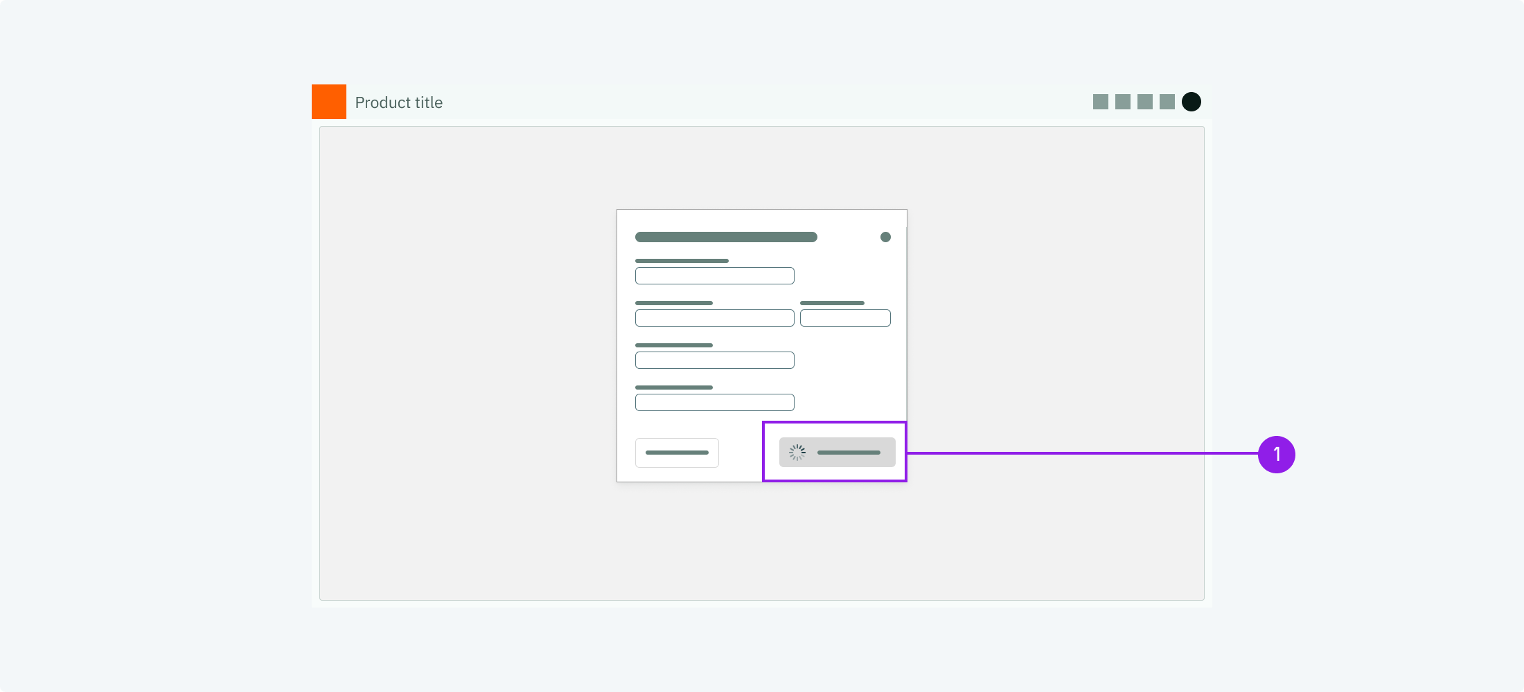
1. Loading spinner

<DataList.Root orientation="vertical" emphasize="label">
  <DataList.Row>
    <DataList.Label>When to use</DataList.Label>
    <DataList.Value marginTop="spacingS">
      Use a loading spinner when the user has triggered an action that needs a
      noticeable time to perform. Therefore spinners are often positioned on
      buttons or near them.
    </DataList.Value>
  </DataList.Row>
  <DataList.Row>
    <DataList.Label>Description</DataList.Label>
    <DataList.Value marginTop="spacingS">
      The spinner is an animated icon that appears next to the element that has
      triggered an action. It should be shown for the duration of the loading
      time.
    </DataList.Value>
  </DataList.Row>
  <DataList.Row>
    <DataList.Label>Behaviour</DataList.Label>
    <DataList.Value marginTop="spacingS">
      Position close to the button that has triggered the action.
    </DataList.Value>
  </DataList.Row>
  <DataList.Row>
    <DataList.Label>Components to use</DataList.Label>
    <DataList.Value marginTop="spacingS">
      <ul margin="none">
        <li>
          <Link href="/components/spinner">Spinner</Link>
        </li>
      </ul>
    </DataList.Value>
  </DataList.Row>
</DataList.Root>