# Notification
> Use notifications to notify users about important events.
Choose the notification component appropriately to its relevance of
notifications, as they can be interruptive. We offer these components:
- Inline notifications, these are minimal invasive as they attach directly
to the element they refer to, such as a form field or a button
- Contextual notifications, these blend into the interface as boxed
messages within the content they relate to
- Toaster notifications,
these draw some more attention, without being too interruptive as text appear
temporary on a the edge of the screen
- Modal notifications, these force the
user to perceive them as they block the whole screen until the user interacted
with it
There are four types of notifications, each with their own styles: info, warning, error, and success.
- Info: use this when the notification is only a "good to know" information
- Warning: use this when the notification informs about a potential issue
- Error: use this to inform the user about an error that has occurred
- success: use this to give feedback about a successfully performed action
## Inline notifications
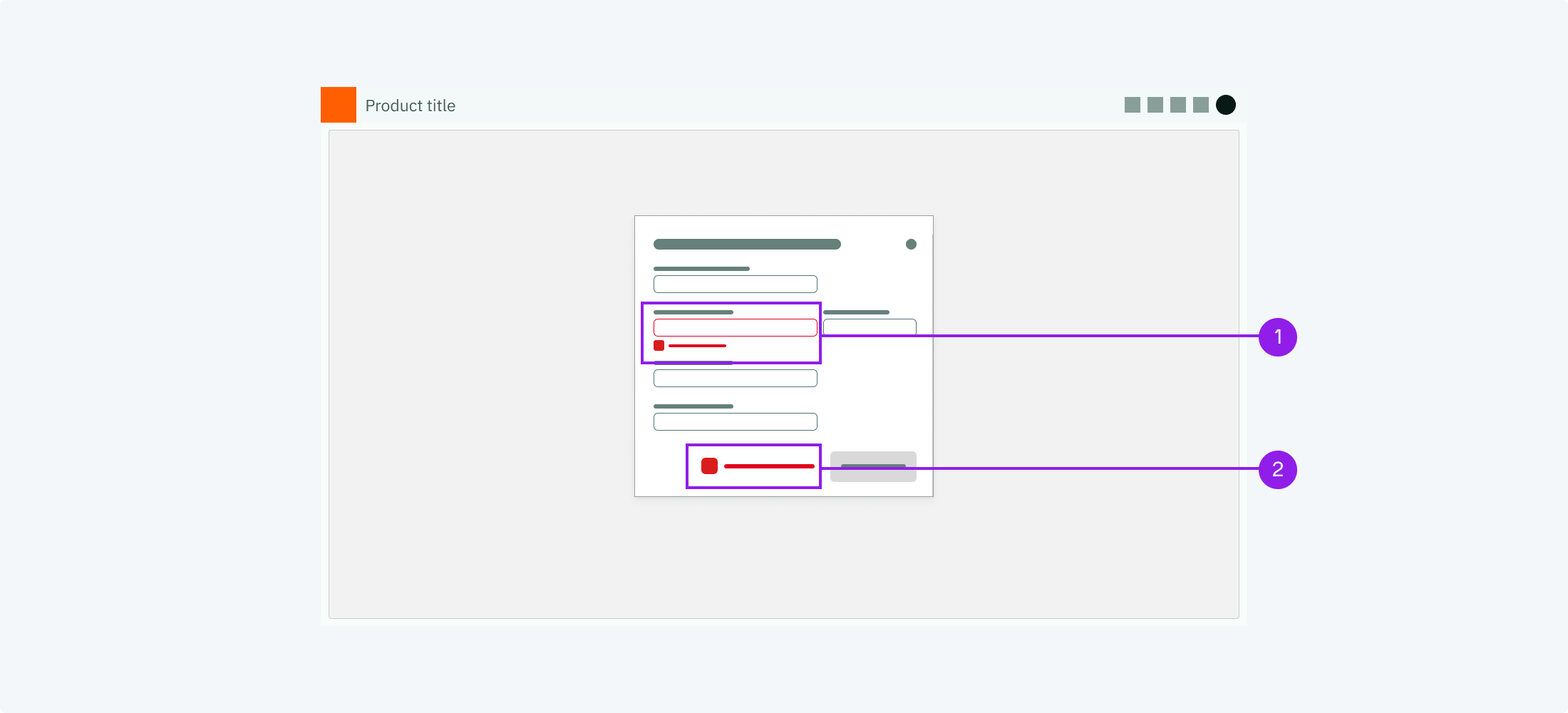
1. Example for an inline error notification on the input field.
2. Example for an inline error notification next to a button.
When to use
Use inline notifications for compact feedback that concerns a single
element, such as a validation message on a form field. The screen does not
change, the message simply appears next to the element it refers to.
Description
Inline notifications are minimal, an icon and a short text without a
surrounding box. They should be as close as possible to the element that
they refer to or that has triggered the notification.
Behaviour
Inline notifications can either be shown on start of a view (if they are
static) or they can pop up (if they are dynamic). They may disappear when
they are not of relevance any longer, e.g. an error notification in a form
disappears when the user has solved the issue.
Components to use
Inline Notification
Form Field's feedback message
{' '}
for validation messages within forms
## Contextual notifications
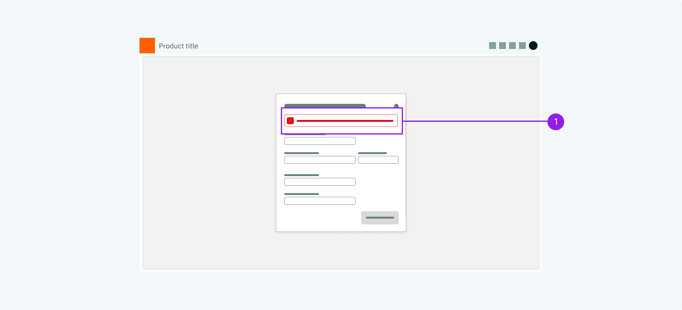
1. Example for a contextual error notification at the top of a form.
When to use
Use a contextual notification to call out important information that
concerns a whole view or a section of it, for example an error that
prevents a form from being submitted, or data that is stale or incomplete.
Prefer it over an inline notification when the message concerns more than
a single element.
Description
Contextual notifications are boxed messages with an icon and optional
actions or a dismiss button. They appear within the content, as close as
possible to the area they refer to, and are typically not user-initiated.
Behaviour
Contextual notifications are persistent. They are shown while their
condition applies and remain until the user dismisses them or resolves the
situation. Unlike toasters, they do not disappear automatically.
Components to use
Notification
## Toasters
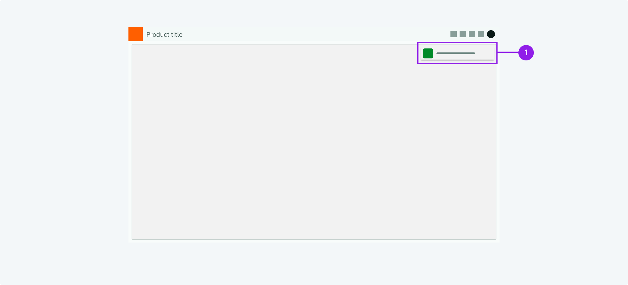
1. Example for a toast notification
When to use
Use toast notifications when you want the user to perceive the message
without interrupting them too much.
Description
Toast notifications convey short messages + an icon to indicate the type
(info, warning, error or success). They may also carry a button to open a
modal, which can be used to show longer messages.
Behaviour
Toast notifications appear temporary. We recommend to show them at the top
right corner of the screen. They should be visible for some seconds and
disappear automatically.
Components to use
Toaster
## Modals
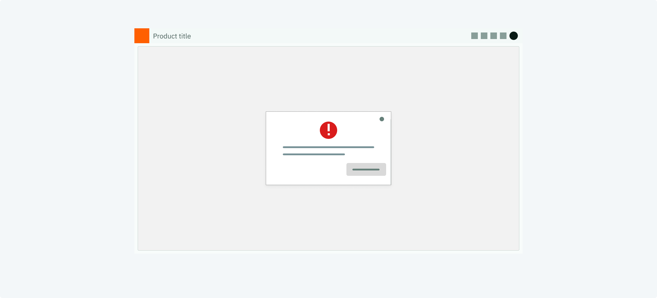
1. Example for a modal notification
When to use
Use a modal notification when there is a sincere message that the user has
to perceive.
Description
Modal notifications block the user by popping up above the regular screen.
This way it is ensured, that the user perceives it.
Behaviour
The modal pop ups above the regular content, centre aligned. It closes
only on user interaction.
Components to use
Dialog
## When not to use
- Do not notify users about information that is currently on screen (e.g. active chat conversations)
- Do not notify users about technical operations that do not require user involvement (such as syncing)
- Do not notify users about error messages that can be resolved without user action