# Colours
> By keeping the usage of colours systematic, we are distinguishing our brand and creating a consistent experience across products.
## Colours
For consistency and brand awareness, we use the below defined colour palettes throughout our interfaces.
## Neutral palette
The neutral colour palette is used for typography and most backgrounds.
Neutral colours help you structure your content. They set a calm and not distracting environment. They don’t typically have a meaning associated with them, though they can imply things like disabled states of elements.
> **Tip**
>
> Our neutral palette is slightly saturated with the hue close to our accent hue
> to create more harmonious vibe.
---
## Accent palette
The accent colour palette is used in logical ways throughout the product to guide the eye and highlight
the important, interactive UI bits.
---
## Notification palette
Each colour in the notification colour palette is selected intentionally to provide meaningful feedback within our experiences.
Notification colours should be used purposefully to communicate and inform users.
### Info
Info palette is used to indicate informative notifications, progress, and labels in the system.
### Success
Success palette is used to indicate success states. Green is a vibrant colour and should be used sparingly to convey a positive feeling.
### Warning
Warning palette is used to indicate a warning or that progress is hindered. Use yellow to indicate to indicate a user that an issue can be avoided or needs a corrective action.
### Danger
Danger palette is used to indicate error states and messages. Red is an alarming colour and should be used with care as it can convey a negative feeling.
---
## Functional tokens
Base colour tokens listed above just represent a static colour value and looking at them doesn't tell you much about possible applications.
Functional tokens allow us to abstract values to attach a meaning to their intended usage.
They allow us to layer references on top of base colour tokens to enable more predictable combination and application of colours.
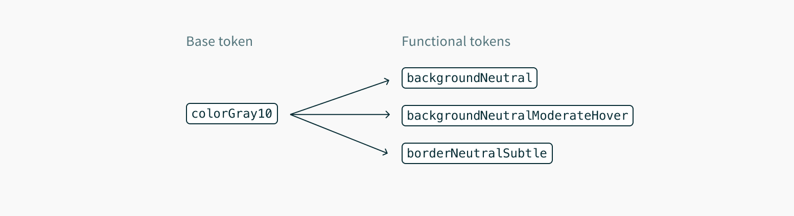
Migration to functional tokens will allow easier implementation of new colour-related features like dark mode, custom themes or even simplify future product rebranding.
Functional tokens act as an API on top of our colour palettes, in a sense that the tokens can be referenced without worrying about their underlying value.
Apps that stick to the tokens will get all future colour and theme updates "for free", which is a win for maintainability going forward.
> **Tip**
>
> Avoid referencing colour scales by their actual scale name like `colorGray100`. Instead, use the functional tokens whenever possible. In rare cases, you may need to use explicit scale tokens to define custom functional variables in your application.
> **Tip**
>
> We use fairly generic names for the functional colour tokens that work as a guide for the application but don't rely on our component inventory, thus can also be used to build your custom components.
Every functional colour token follows the same predictable naming convention that helps provide an understanding on how or when the token should be used.
The format of the name is: `[property][role][variant][state]`, where:
- `property` is a UI entity the token will be applied to, such as `background` or `border`.
- `role` describes the intention behind the token.
- `variant` refers to variations of the token, for example how prominent it appears. Prominence scale ranges from `minimal` to `contrast`.
- `state` is optional and can represent available interaction options such as `hover` or `active`.
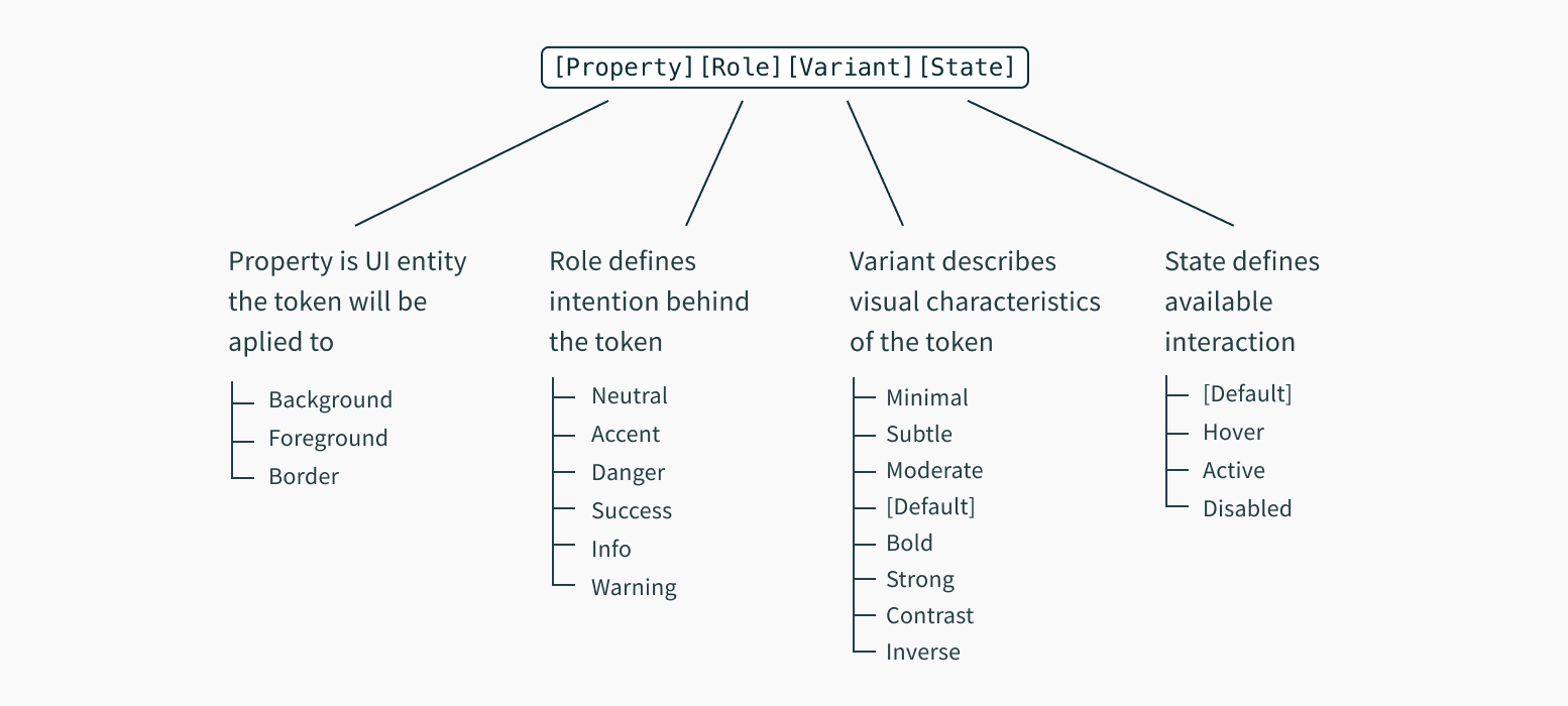
This gives us final token names like:
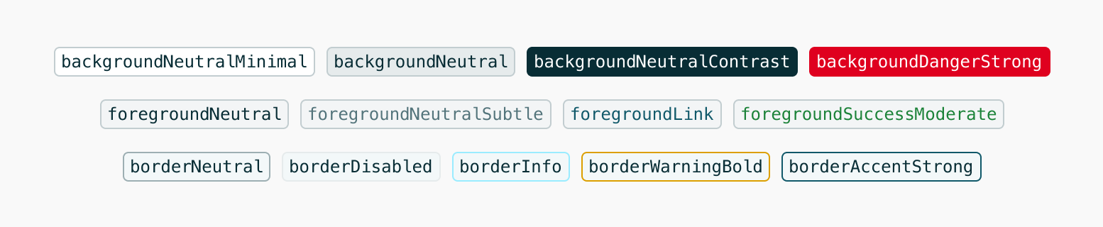
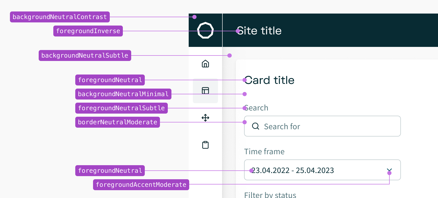
Finally, the functional tokens are referenced throughout component styles:
```jsx
import { styled } from '@volue/wave-react';
const Component = styled('div', {
backgroundColor: '$backgroundSuccessStrong',
color: '$foregroundSuccessInverse',
'&:hover': {
backgroundColor: '$backgroundSuccessStrongHover'
}
});
```
> **Tip**
>
> Functional tokens are available for use in [all styling APIs](https://next.wave-design-system.pages.dev/get-started/developing.md#styling-apis) that `@volue/wave-react` offers.
Our functional colour tokens belong to one of three groups: [background](#background-tokens), [foreground](#foreground-tokens) and [border](#border-tokens).
### Pairing
It is recommended to pair default colour foregrounds with their default and subtle background counterparts.
These pairings are designed to be legible and meet [accessibility guidance](#colours-accessibility) (WCAG AA contrast requirements).
However not all colours pair well with each other. For example you shouldn't combine default foregrounds with strong backgrounds as that will result in inaccessible pairings. Instead, use inverse foreground tokens designed to show on strong backgrounds for optimal contrast.
Here are some general colour pairings that have been designed and tested for accessible contrast ratios:
```jsx
{'Aa'}
{'Aa'}
{'Aa'}
{'Aa'}
{'Aa'}
{'Aa'}
{'Aa'}
{'Aa'}
{'Aa'}
{'Aa'}
{'Aa'}
{'Aa'}
{'Aa'}
{'Aa'}
{'Aa'}
{'Aa'}
{'Aa'}
```
Use `hover`, `active` and `disabled` tokens to communicate visual changes related to interaction states:
```jsx
{'Actionable item'}
{'Selected item'}
{'Pseudo button'}
{'Pseudo disabled button'}
```
### CSS variables
Colour tokens exist in different formats and can be also consumed as [CSS custom properties](https://developer.mozilla.org/en-US/docs/Web/CSS/--*) or variables.
You can use any styling solution to read those variables.
> **Tip**
>
> CSS variables come automatically bundled with `@volue/wave` core package.
CSS variable names are formatted in [kebab-case](https://en.wikipedia.org/wiki/Letter_case#Kebab_case):
```css
.element {
background: var(--color-background-neutral-moderate);
color: var(--color-foreground-neutral);
}
```
There are even more ways of integrating tokens into your product with help of `@volue/design-colors` package.
---
### Background tokens
Background colour tokens define the background colours used in surfaces of components or UI elements. Do not use these for border colours or foreground colours.
---
### Foreground tokens
Foreground colour tokens are used for text content, icons, and other elements rendered on top of a background. Do not use these for border colours or background colours.
> **Tip**
>
> Regular foreground colours tokens ensure enough contrast ratio when used on top of default, `minimal` and `subtle` background colour tokens.
>
> Note that icons have different contrast requirements than text. Since they are graphical objects, they only need to meet a 3:1 colour contrast ratio ([WCAG 1.4.11](https://www.w3.org/TR/WCAG21/#non-text-contrast)), as opposed to text, which must meet 4.5:1 contrast ratio ([WCAG 1.4.3](https://www.w3.org/TR/WCAG21/#contrast-minimum)).
---
### Border tokens
Border colour tokens define the colour of borders, as seen in toasts, cards, form fields, and more. Do not use these for background colours or foreground colours.
---
### RGB channels
When a token translates to `#000000` (hex) or `rgb(0, 0, 0)` colour value in CSS, it becomes a challenge to apply opacity just to the colour value without making the whole component transparent.
While sticking to solid colours is the default, recommended way, in some special cases there might be a need to reduce the opacity of a colour. For example, transparent shades adapt easier to different backgrounds, since they keep the contrast between the element and its background more consistent.
That's why for a subset of background colour tokens, their RGB channel values are exposed as separate tokens to be combined with an alpha/opacity. You can use them with the [rgba colour function](https://www.w3.org/TR/css-color-4/#rgb-functions) like this:
```jsx
const Component = styled('div', {
backgroundColor: 'rgba($rgbBackgroundNeutralBold, 0.15)'
});
```
```css
.element {
background: rgba(var(--color-rgb-background-neutral-bold), 0.15);
}
```
The following rgb channel tokens are available:
token.path.includes('background'))}
/>
---
## Secondary colours
Colours other than Aqua, Green, Yellow and Red have a unique purpose and should be used only only for data visualisation and information highlighting.
> **Tip**
>
> Data visualisation is the representation of information in pictorial or graphical format, such as charts, graphs, maps, and diagrams.
### Teal
### Purple
### Pink
### Blue
### Lazuli
### Lime
### Orange
### Pear
### Brown
---
### RGB channels
RGB channel values of secondary colours are exposed as separate tokens to be combined with an alpha/opacity.
> **Tip**
>
> See [functional tokens RGB channels](#rgb-channels) for example usage.
!token.path.includes('background'))}
/>
---
## Colours accessibility
Found colours in the Wave palette that you would like to use together, but not sure if they will pass WCAG AA contrast requirements?
Recommended tools below can find you to test the colours you're planning on using to see if the pair meets the minimum colour contrast requirements.